Display Options
The display options allow you to control much of the picker's look and feel. You can disable components, buttons and change the default icons.
new tempusDominus.TempusDominus(document.getElementById('datetimepicker1'),
  {
    display: {
      icons: {
        type: 'icons',
        time: 'fa-solid fa-clock',
        date: 'fa-solid fa-calendar',
        up: 'fa-solid fa-arrow-up',
        down: 'fa-solid fa-arrow-down',
        previous: 'fa-solid fa-chevron-left',
        next: 'fa-solid fa-chevron-right',
        today: 'fa-solid fa-calendar-check',
        clear: 'fa-solid fa-trash',
        close: 'fa-solid fa-xmark'
      },
      sideBySide: false,
      calendarWeeks: false,
      viewMode: 'calendar',
      toolbarPlacement: 'bottom',
      keepOpen: false,
      buttons: {
        today: false,
        clear: false,
        close: false
      },
      components: {
        calendar: true,
        date: true,
        month: true,
        year: true,
        decades: true,
        clock: true,
        hours: true,
        minutes: true,
        seconds: false,
        //deprecated use localization.hourCycle = 'h24' instead
        useTwentyfourHour: undefined
      },
      inline: false,
      theme: 'auto',
      keyboardNavigation: true
    }
)
icons
Accepts: string
Any icon library that expects icons to be used like
<i class='fas fa-calendar'></i> will work, provided you include the
correct
styles and scripts needed.
Icon sprites are also supported.
type
Accepts either "icons" or "sprites"
Defaults to "icons". If "sprites" is used as the value, the icons will be render with an svg
element
instead
of an "i" element. If you don't know which you should use, leave it as "icons".
time
Defaults: (fas
fa-clock)
This icon is used to change the view from the calendar view to the clock view.
date
Defaults: (fas
fa-calendar)
This icon is used to change the view from the clock view to the calendar view.
up
Defaults: (fas
fa-arrow-up)
This icon is used to increment hours, minutes and seconds in the clock view.
down
Defaults: (fas
fa-arrow-down)
This icon is used to decrement hours, minutes and seconds in the clock view.
next
Defaults: (fas
fa-chevron-right)
This icon is used to navigation forward in the calendar, month, year, and decade views.
previous
Defaults: (fas
fa-chevron-left)
This icon is used to navigation backwards in the calendar, month, year, and decade views.
today
Defaults:
(fas fa-calendar-check)
This icon is used to change the date and view to now.
clear
Defaults: (fas
fa-trash)
This icon is used to clear the currently selected date.
close
Defaults: (fas
fa-times)
This icon is used to close the picker.
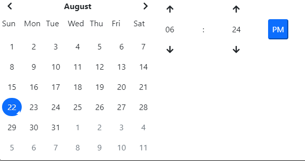 Displays the date and time pickers side by side.
calendarWeeks
Accepts: true|false Defaults: false
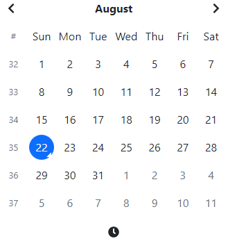 Displays an additional column with the calendar week for that week.
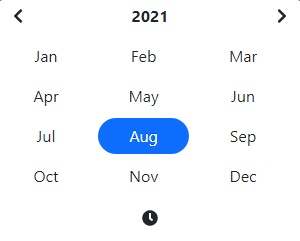
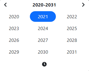
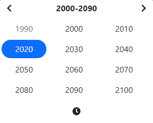
viewMode
Accepts: 'clock' | 'calendar' | 'months' | 'years' | 'decades'
Defaults: calendar
The default view when the picker is displayed. Set to "years" for a date of birth picker.
toolbarPlacement
Accepts: 'top' | 'bottom' Defaults: bottom
Changes the placement of the toolbar where the today, clear, component switch icon are located.
Throws unexpectedOptionValue if value is not one of the accepted values.
keepOpen
Accepts: true|false Defaults: false
Keep the picker window open even after a date selection. The picker can still be closed by the
target or
clicking on an outside element. This option will only work when time components are disabled.

components
Accepts: true|false
These options turns on or off the particular views. If option is false for date the
user would only be able to select month and year for instance.
calendar
Defaults: true
A convenience flag that can enable or disable all the calendar components like date,
month, year, decades, century. This flag must be true for any of the calendar components to be visible,
even if those
options are true.
date
Defaults: true
month
Defaults: true
 Turns on or off the month selection view.
year
Defaults: true
decades
Defaults: true
clock
Defaults: true
A convenience flag that can enable or disable all the calendar components like date,
month, year,
decades, century.
This flag must be true for any of the calendar components to be visible, even if those
options are true.
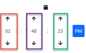
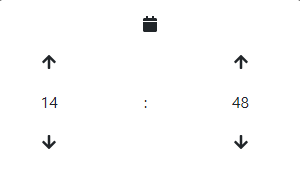
hours
Defaults: true
Displayed above in red
minutes
Defaults: true
Displayed above in purple
seconds
Defaults: false
Displayed above in green
useTwentyfourHour
Deprecated
This option has been deprecated and will be removed in a future version.
Use localization.hourCycle instead.
theme
Accepts: 'light' | 'dark' | 'auto' Defaults: 'auto'
Specifies which theme to use, light mode or dark mode. When set to auto, it will auto detect based on settings
of the user's system.
placement
Accepts: 'top' | 'bottom' Defaults: 'bottom'
Specifies whether the picker should be displayed at the top or bottom of the element passed to the picker instance.
keyboardNavigation
Accepts: boolean Defaults: true
Specifies whether the picker should allow keyboard navigation. For more information, see the section on keyboard navigation.