Options
Options can be provided during the initial setup through the constructor new
tempusDominus.TempusDominus(..., options);. Take a look at the examples for more information.
The current options can be retrieved e.g. datetimepicker1.optionsStore.options.
Options can be updated through the updateOptions
function.
All options will throw typeMismatch if the provided type does not match the expected type, e.g. a string instead of a boolean.
new tempusDominus.TempusDominus(document.getElementById('datetimepicker1'),
{
  allowInputToggle: false,
  container: undefined,
  dateRange: false,
  debug: false,
  defaultDate: undefined,
  display: {
    icons: {
      type: 'icons',
      time: 'fa-solid fa-clock',
      date: 'fa-solid fa-calendar',
      up: 'fa-solid fa-arrow-up',
      down: 'fa-solid fa-arrow-down',
      previous: 'fa-solid fa-chevron-left',
      next: 'fa-solid fa-chevron-right',
      today: 'fa-solid fa-calendar-check',
      clear: 'fa-solid fa-trash',
      close: 'fa-solid fa-xmark'
    },
    sideBySide: false,
    calendarWeeks: false,
    viewMode: 'calendar',
    toolbarPlacement: 'bottom',
    keepOpen: false,
    buttons: {
      today: false,
      clear: false,
      close: false
    },
    components: {
      calendar: true,
      date: true,
      month: true,
      year: true,
      decades: true,
      clock: true,
      hours: true,
      minutes: true,
      seconds: false,
      useTwentyfourHour: undefined
    },
    inline: false,
    theme: 'auto',
    keyboardNavigation: true
  },
  keepInvalid: false,
  localization: {
    clear: 'Clear selection',
    close: 'Close the picker',
    dateFormats: DefaultFormatLocalization.dateFormats,
    dayViewHeaderFormat: { month: 'long', year: '2-digit' },
    decrementHour: 'Decrement Hour',
    decrementMinute: 'Decrement Minute',
    decrementSecond: 'Decrement Second',
    format: DefaultFormatLocalization.format,
    hourCycle: DefaultFormatLocalization.hourCycle,
    incrementHour: 'Increment Hour',
    incrementMinute: 'Increment Minute',
    incrementSecond: 'Increment Second',
    locale: DefaultFormatLocalization.locale,
    nextCentury: 'Next Century',
    nextDecade: 'Next Decade',
    nextMonth: 'Next Month',
    nextYear: 'Next Year',
    ordinal: DefaultFormatLocalization.ordinal,
    pickHour: 'Pick Hour',
    pickMinute: 'Pick Minute',
    pickSecond: 'Pick Second',
    previousCentury: 'Previous Century',
    previousDecade: 'Previous Decade',
    previousMonth: 'Previous Month',
    previousYear: 'Previous Year',
    selectDate: 'Select Date',
    selectDecade: 'Select Decade',
    selectMonth: 'Select Month',
    selectTime: 'Select Time',
    selectYear: 'Select Year',
    startOfTheWeek: 0,
    today: 'Go to today',
    toggleMeridiem: 'Toggle Meridiem',
    toggleAriaLabel?: string;
  },
  meta: {},
  multipleDates: false,
  multipleDatesSeparator: '; ',
  promptTimeOnDateChange: false,
  promptTimeOnDateChangeTransitionDelay: 200,
  restrictions: {
    minDate: undefined,
    maxDate: undefined,
    disabledDates: [],
    enabledDates: [],
    daysOfWeekDisabled: [],
    disabledTimeIntervals: [],
    disabledHours: [],
    enabledHours: []
  },
  stepping: 1,
  useCurrent: true,
  viewDate: new DateTime()
})
dateRange (as of 6.4.1)
Accepts boolean Defaults: false
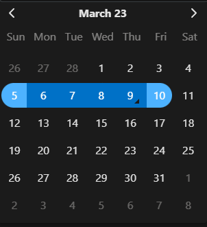 Date Range work similar to multi date. You should also set multiDateSeparator with what you want the two values to be separated with. This option allows the user to select two dates and highlights all the dates in range between. Validation still takes place. The range will be consider invalid if any of the dates in the range are disabled.
stepping
Accepts number Defaults: 1
Controls how much the minutes are changed by. This also changes the minute selection grid to step by this
amount.
useCurrent
Accepts true|false Defaults: true
Determines if the current date/time should be used as the default value when the picker is opened.
defaultDate
Accepts: string | Date | DateTime Defaults: undefined
Sets the picker default date/time. Overrides useCurrent
keepInvalid
Accepts true|false Defaults: false
Allows for the user to select a date that is invalid according to the rules. For instance, if a user enters a date
pasted the maxDate.
debug
Accepts true|false Defaults: false
Similar to display.keepOpen, if true the picker won't close during any event where that would
normally
occur. This is useful when trying to debug rules or css changes. Note you can also use window.debug =
true in the dev tools console. Using the window object is useful for debugging deployed code without
requiring a configuration change.
viewDate
Accepts: string | Date | DateTime Defaults: now
Set the view date of the picker. Setting this will not change the selected date(s).
multipleDatesSeparator
Accepts: string Defaults: ;
When multipleDates is enabled, this value wil be used to separate the selected dates. E.g. 08/29/2021,
12:00 AM; 08/30/2021, 12:00 AM; 08/23/2021, 12:00 AM
promptTimeOnDateChange
Accepts true|false Defaults: false
If enabled and any of the time components are enabled, when a user selects a date the picker will automatically
display the clock view after promptTimeOnDateChangeTransitionDelay.
promptTimeOnDateChangeTransitionDelay
Accepts number Defaults: 200
Used with promptTimeOnDateChange. The number of milliseconds before the picker will display the
clock
view.
meta
Accepts object Defaults: {}
This property is to provide developers a place to store extra information about the picker. You can use this to
store database format strings for instance. There are no rules on what you add to this object and the picker
will not reference it.
container
Accepts HTMLElement Defaults: undefined
Change the target container to use for the widget instead of body (In case of application using
shadow DOM for example).