Options
data attribute e.g. $('#datetimepicker').datetimepicker(OPTION, ARGUMENT)
**TODO** should I move some of this to the component?
options
Returns the components current options object. Note that the changing the values of the returned object does not change the components actual configuration. Use options(options) to set the components options massively or the other methods for setting config options individually.
options, [options]
Takes an object variable with option key:value properties and configures the component. Use this to update multiple options on the component.
date
Returns the component's model current date, a moment object or null if not set.
date, [newDate]
Takes string, Date, moment, null parameter and sets the components model current moment to it. Passing a null value unsets the components model current moment. Parsing of the newDate parameter is made using moment library with the options.format and options.useStrict components configuration.
Throws
TypeError- in case thenewDatecannot be parsed
Emits
change.datetimepicker- In casenewDateis different from current moment
format
Default: false
See momentjs' docs for valid formats. Format also dictates what components are shown, e.g. MM/dd/YYYY will not display the time picker.
format
Returns the component's options.format string
format, [format]
Takes a moment.js format string and sets the components options.format. This is used for displaying and also for parsing input strings either from the input element the component is attached to or the date() function.
The parameter can also be a boolean:false in which case the format is set to the locale's L LT.
Note: this is also used to determine if the time picker sub component will display the hours in 12 or 24 format. (if a or h exists in the passed string then a 12 hour mode is set)
dayViewHeaderFormat
Default: 'MMMM YYYY'
Changes the heading of the date picker when in "days" view.
dayViewHeaderFormat
Returns a string variable with the currently set options.dayViewHeaderFormat option.
dayViewHeaderFormat, [string]
Takes a string value.
Used to customize the header of the day view.
extraFormats
Default: false
Allows for several input formats to be valid. See this PR.
extraFormats
Returns a boolean or array with the options.extraFormats option configuration
extraFormats, [formats]
Takes an array of valid input moment format options.
stepping
Default: 1
Number of minutes the up/down arrow's will move the minutes value in the time picker
stepping
Returns a number with the options.stepping option configuration
stepping, [number]
Takes a number. This be the amount the up/down arrows move the minute value with a time picker.
min/maxDate
Default: false
Accepts: date, moment, string
Prevents date/time selections before this date. Will override defaultDate and useCurrent if either of these settings are the same day since both options are invalid according to the rules you've selected.
minDate
Returns the currently set moment of the options.minDate or false if not set
minDate, [minDate]
Takes a minDate string, Date, moment, boolean:false parameter and disallows the user to select a moment that is before that moment. If a boolean:false value is passed the options.minDate parameter is cleared and there is no restriction to the minimum moment the user can select.
Note: If the minDate parameter is after the currently selected moment the currently selected moment changes to minDate parameter
Throws
-
TypeError- ifminDateparameter cannot be parsed using theoptions.formatandoptions.useStrictconfiguration settings -
TypeError- ifminDateparameter is afteroptions.maxDate
Emits
-
change.datetimepicker- if the newminDateis after currently selected moment (waiting for #472 to close in order to finalize this part) -
dp.error- if the newminDateis after currently selected moment (waiting for #472 to close in order to finalize this part)
maxDate
Returns the currently set moment of the options.maxDate or false if not set
maxDate, [maxDate]
Takes a [maxDate] string, Date, moment, boolean:false parameter and disallows the user to select a moment that is after that moment. If a boolean:false value is passed options.maxDate is cleared and there is no restriction to the maximum moment the user can select.
Note: If [maxDate] is before the currently selected moment the currently selected moment changes to [maxDate]
Throws
-
TypeError- ifmaxDateparameter cannot be parsed using theoptions.formatandoptions.useStrictconfiguration settings -
TypeError- ifmaxDateparameter is beforeoptions.minDate
Emits
-
change.datetimepicker- if the newmaxDateis after currently selected moment (waiting for #472 to close in order to finalize this part) -
dp.error- if the newmaxDateis after currently selected moment (waiting for #472 to close in order to finalize this part)
useCurrent
Default: true
On show, will set the picker to the current date/time.
useCurrent
Returns a boolean or string with the options.useCurrent option configuration
useCurrent, boolean or string
Takes a boolean or string. If a boolean true is passed and the components model moment is not set (either through setDate or through a valid value on the input element the component is attached to) then the first time the user opens the datetimepicker widget the value is initialized to the current moment of the action. If a false boolean is passed then no initialization happens on the input element. You can select the granularity on the initialized moment by passing one of the following strings ('year', 'month', 'day', 'hour', 'minute') in the variable.
If for example you pass 'day' to the setUseCurrent function and the input field is empty the first time the user opens the datetimepicker widget the input text will be initialized to the current date time with day granularity (e.g. if current time = 2014-08-10 13:32:33 the input value will be initialized to 2014-08-10 00:00:00)
Note: If the options.defaultDate is set or the input element the component is attached to has already a value that takes precedence and the functionality of useCurrent is not triggered!
collapse
Default: true
Using a Bootstraps collapse to switch between date/time pickers.
collapse
Returns a boolean of the options.sideBySide.
collapse, [collapse]
Takes a boolean. If set to false the picker will display similar to sideBySide except vertical.
locale
Default: moment.locale()
Accepts: string, moment.local('locale')
See momentjs for valid locales.
You must include moment-with-locales.js or a local js file.
locale
Returns the currently set locale of the options.locale
locale, [newLocale]
Takes a string of any valid moment locale e.g. de for German.
Throws
TypeError- if the locale is not loaded via a separate script ormoment-with-locales
defaultDate
Default: false
Accepts: date, moment, string
Sets the picker default date/time. Overrides useCurrent
defaultDate
Returns a moment with the options.defaultDate option configuration or false if not set
defaultDate, [defaultDate]
Takes a string, Date, moment, boolean:false. Will set the picker's initial date. If a boolean:false value is passed the options.defaultDate parameter is cleared.
-
TypeError- if the provided date pass validation, includingdisabledDates,enabledDates,minDate,maxDate, anddaysOfWeekDisabled -
TypeError- if the provided date cannot be parsed by moment.js
en/disabledDates
Default: false
Accepts: array of [date, moment, string]
disabledDates
Returns an array with the currently set disabled dates on the component.
disabledDates, [dates]
Takes an [ string or Date or moment ] of values and disallows the user to select those days. Setting this takes precedence over options.minDate, options.maxDate configuration. Also calling this function removes the configuration of options.enabledDates if such exist.
Note: These values are matched with Day granularity.
enabledDates
Returns an array with the currently set enabled dates on the component.
enabledDates, [dates]
Takes an [ string or Date or moment ] of values and allows the user to select only from those days. Setting this takes precedence over options.minDate, options.maxDate configuration. Also calling this function removes the configuration of options.disabledDates if such exist.
Note: These values are matched with Day granularity.
icons
Default: {
            time: 'glyphicon glyphicon-time',
            date: 'glyphicon glyphicon-calendar',
            up: 'glyphicon glyphicon-chevron-up',
            down: 'glyphicon glyphicon-chevron-down',
            previous: 'glyphicon glyphicon-chevron-left',
            next: 'glyphicon glyphicon-chevron-right',
            today: 'glyphicon glyphicon-screenshot',
            clear: 'glyphicon glyphicon-trash',
            close: 'glyphicon glyphicon-remove'
        }
Accepts: object with all or some of the parameters above
Change the default icons for the pickers functions.
icons
Returns an Ojbect of options.icons
icons, [icons]
Takes an Ojbect of strings.
Throws
TypeError- if icons parameter is not anOjbect
useStrict
Default: false
Defines if moment should use strict date parsing when considering a date to be valid.
useStrict
Returns a boolean of the options.useStrict
useStrict, [useStrict]
Takes a boolean. If useStrict is true, moment.js parsing rules will be stricter when determining if a date is valid or not.
sideBySide
Default: false
Shows the picker side by side when using the time and date together.
sideBySide
Returns a boolean of the options.sideBySide.
sideBySide, [sideBySide]
Takes a boolean. If sideBySide is true and the time picker is used, both components will display side by side instead of collapsing.
daysOfWeekDisabled
Default: []
Accepts: array of numbers from 0-6
Disables the section of days of the week, e.g. weekends.
daysOfWeekDisabled
Returns an array with the options.daysOfWeekDisabled configuration setting of the component.
daysOfWeekDisabled, [daysOfWeek]
Takes an [ Number:0 to 6 ] and disallow the user to select weekdays that exist in this array. This has lower priority over the options.minDate, options.maxDate, options.disabledDates and options.enabledDates configuration settings.
Emits
-
change.datetimepicker- if the currently selected moment falls in the values passed on the daysOfWeek parameter. (waiting for #472 to close in order to finalize this part) -
dp.error- if the currently selected moment falls in the values passed on the daysOfWeek parameter. (waiting for #472 to close in order to finalize this part)
calendarWeeks
Default: false
Shows the week of the year to the left of first day of the week.
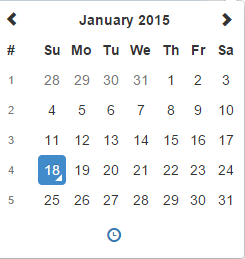
calendarWeeks
Returns a boolean with the current options.calendarWeeks option configuration
calendarWeeks, [boolean]
Takes a boolean variable to set if the week numbers will appear to the left on the days view
viewMode
Default: 'days'
Accepts: 'decades','years','months','days'
The default view to display when the picker is shown.
Note: To limit the picker to selecting, for instance the year and month, use format: MM/YYYY.
viewMode
Returns a string of the options.viewMode.
viewMode, [newViewMode]
Takes a string. Valid values are 'days', 'months', 'years' and 'decades'
Throws
TypeError- ifnewViewModeparameter is not an astringor ifnewViewModeis not a valid value.
toolbarPlacement
Default: 'default'
Accepts: 'default', 'top', 'bottom'
Changes the placement of the icon toolbar.
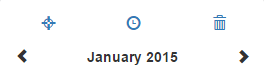
toolbarplacement
Returns a string variable with the currently set options.toolbarplacement option.
toolbarplacement, [string]
Takes a string value. Valid values are 'default', 'top' and 'bottom'.
Changes the placement of the toolbar where the today, clear, component switch icon are located.
buttons
Default: {
            showToday: false,
            showClear: false,
            showClose: false
        }
Accepts: object with all or some of the parameters above
Change the default toolbar buttons for the pickers functions.
buttons
Returns an Ojbect of options.buttons
buttons, [buttons]
Takes an Ojbect of boolean.
Throws
TypeError- if buttons parameter is not anOjbect
widgetPositioning
Default: {
            horizontal: 'auto'
            vertical: 'auto'
         }
Accepts: object with the all or one of the parameters above
         horizontal: 'auto', 'left', 'right'
         vertical: 'auto', 'top', 'bottom'
widgetPositioning
Returns the currently set options.widgetPositioning object containing two keys horizontal and vertical
widgetPositioning, [positioningObject]
Takes an object parameter that can contain two keys vertical and horizontal each having a value of 'auto', 'top', 'bottom' for vertical and 'auto', 'left', 'right' for horizontal which defines where the dropdown with the widget will appear relative to the input element the component is attached to.
'auto' is the default value for both horizontal and vertical keys and it tries to automatically place the dropdown in a position that is visible to the user. Usually you should not override those options unless you have a special need in your layout.
widgetParent
Default: null
Accepts: string or jQuery object
On picker show, places the widget at the identifier (string) or jQuery object if the element has css position: 'relative'
widgetParent
Returns a $(element) variable with the currently set options.widgetParent option.
widgetParent, [widgetParent]
Takes a string or $(element) value.
keepOpen
Default: false
Will cause the date picker to stay open after selecting a date.
keepOpen
Returns a boolean variable with the currently set options.keepOpen option.
keepOpen, [boolean]
Takes a boolean value.
inline
Default: false
Will display the picker inline without the need of a input field. This will also hide borders and shadows.
inline
Returns a boolean variable with the currently set options.inline option.
inline, [boolean]
Takes a boolean value.
keepInvalid
4.7.14
Default: false
Will cause the date picker to not revert or overwrite invalid dates.
keepInvalid
Returns a string variable with the currently set options.keepInvalid option.
keepInvalid, [boolean]
Takes a boolean value.
If true, invalid dates will not be reverted to a previous selection or changed.
keyBinds
Default: up: function (widget) {
            if (widget.find('.datepicker').is(':visible')) {
                this.date(this.date().clone().subtract(7, 'd'));
            } else {
                this.date(this.date().clone().add(1, 'm'));
            }
        },
        down: function (widget) {
            if (!widget) {
                this.show();
            }
            else if (widget.find('.datepicker').is(':visible')) {
                this.date(this.date().clone().add(7, 'd'));
            } else {
                this.date(this.date().clone().subtract(1, 'm'));
            }
        },
        'control up': function (widget) {
            if (widget.find('.datepicker').is(':visible')) {
                this.date(this.date().clone().subtract(1, 'y'));
            } else {
                this.date(this.date().clone().add(1, 'h'));
            }
        },
        'control down': function (widget) {
            if (widget.find('.datepicker').is(':visible')) {
                this.date(this.date().clone().add(1, 'y'));
            } else {
                this.date(this.date().clone().subtract(1, 'h'));
            }
        },
        left: function (widget) {
            if (widget.find('.datepicker').is(':visible')) {
                this.date(this.date().clone().subtract(1, 'd'));
            }
        },
        right: function (widget) {
            if (widget.find('.datepicker').is(':visible')) {
                this.date(this.date().clone().add(1, 'd'));
            }
        },
        pageUp: function (widget) {
            if (widget.find('.datepicker').is(':visible')) {
                this.date(this.date().clone().subtract(1, 'M'));
            }
        },
        pageDown: function (widget) {
            if (widget.find('.datepicker').is(':visible')) {
                this.date(this.date().clone().add(1, 'M'));
            }
        },
        enter: function () {
            this.hide();
        },
        escape: function () {
            this.hide();
        },
        'control space': function (widget) {
            if (widget.find('.timepicker').is(':visible')) {
                widget.find('.btn[data-action="togglePeriod"]').click();
            }
        },
        t: function () {
            this.date(moment());
        },
        'delete': function () {
            this.clear();
        }
Allows for custom events to fire on keyboard press.
keyBinds
Returns a string variable with the currently set options.keyBinds option.
keyBinds, [object]
Takes an object value.
Allows for several keyBinding functions to be specified for ease of access or accessibility. See the options page for defaults.
debug
Default: false
Will cause the date picker to stay open after a blur event.
ignoreReadonly
Default: false
Allow date picker show event to fire even when the associated input element has the readonly="readonly" property.
ignoreReadonly
Returns a boolean variable with the currently set options.ignoreReadonly option.
ignoreReadonly, [boolean]
Takes a boolean value.
Set this to true to allow the picker to be used even if the input field is readonly. This will not bypass the disabled property
disabledTimeIntervals
Default: false
Disables time selection between the given moments.
disabledTimeIntervals
Returns an array variable with the currently set options.disabledTimeIntervals option.
disabledTimeIntervals, [array]
Takes a array value.
The array must be in the following format [moment(),moment()]
For example:
disabledTimeIntervals: [[moment({ h: 0 }), moment({ h: 8 })], [moment({ h: 18 }), moment({ h: 24 })]]
Will disable times between 12-8am and 6-12pm today
allowInputToggle
Default: false
If true, the picker will show on textbox focus and icon click when used in a button group.
allowInputToggle
Returns a boolean variable with the currently set options.allowInputToggle option.
allowInputToggle, [boolean]
Takes a boolean value.
If true, the picker will show on textbox focus and icon click when used in a button group
focusOnShow
Default: true
If false, the textbox will not be given focus when the picker is shown.
focusOnShow
Returns a boolean variable with the currently set options.focusOnShow option.
focusOnShow, [boolean]
Takes a boolean value.
If false, the textbox will not be given focus when the picker is shown
en/disabledHours
Default: false
disabledHours
Returns an array variable with the currently set options.en/disabledHours option.
disabledHours, boolean
Takes a array value.
Must be in 24 hour format. Will allow or disallow hour selections (much like disabledTimeIntervals) but will affect all days.
Like en/disabledDates, these options are mutually exclusive and will reset one of the options back to false.
disabledHours: [0, 1, 2, 3, 4, 5, 6, 7, 8, 18, 19, 20, 21, 22, 23, 24]
enabledHours: [9, 10, 11, 12, 13, 14, 15, 16]
viewDate
Default: false
This will change the viewDate without changing or setting the selected date.
parseInputDate
parseInputDate
Returns a function with the currently set options.parseInputDate
parseInputDate, [function]
Takes a function
Allows custom input formatting For example: the user can enter 'yesterday' or '30 days ago.
Example:
var parseRelativeDate = function(relativeDate) {

    switch (relativeDate) {
        case 'today':
            return moment()
        case 'yesterday':
            return moment().subtract(1, 'day');
        default:
            return moment()
                .subtract(Number(relativeDate.replace("days ago", "").trim()), 'days');
    }
}

var parseInputDate = function(inputDate) {
    var relativeDatePattern = /today|yesterday|[0-9]+\s+(days ago)/,
        resultDate;

    if (moment.isMoment(inputDate) || inputDate instanceof Date) {
        resultDate = moment(inputDate);
    } else {
        var relativeDate = inputDate.match(relativeDatePattern),
            parseDate = null;

        if (relativeDate !== null)
          parseDate = this.parseRelativeDate(inputDate.match(relativeDatePattern)[0]);
        else
          parseDate = moment();

        resultDate = moment(parseDate, "YYYY-MM-DD");
    }

    return resultDate;
}
tooltips
tooltips: {
    today: 'Go to today',
    clear: 'Clear selection',
    close: 'Close the picker',
    selectMonth: 'Select Month',
    prevMonth: 'Previous Month',
    nextMonth: 'Next Month',
    selectYear: 'Select Year',
    prevYear: 'Previous Year',
    nextYear: 'Next Year',
    selectDecade: 'Select Decade',
    prevDecade: 'Previous Decade',
    nextDecade: 'Next Decade',
    prevCentury: 'Previous Century',
    nextCentury: 'Next Century',
    incrementHour: 'Increment Hour',
    pickHour: 'Pick Hour',
    decrementHour:'Decrement Hour',
    incrementMinute: 'Increment Minute',
    pickMinute: 'Pick Minute',
    decrementMinute:'Decrement Minute',
    incrementSecond: 'Increment Second',
    pickSecond: 'Pick Second',
    decrementSecond:'Decrement Second'
}
This will change the tooltips over each icon to a custom string.
tooltips
Returns an Ojbect of options.tooltips
tooltips, [tooltips]
Takes an Ojbect of strings.
Throws
TypeError- iftooltipsparameter is not anOjbect
timeZone
timeZone: ''
Allows the setting of the Time Zone. You must include moment-timezone.js and moment-timzone data. See moment timezone documentation for usage.
timeZone
Returns an string of options.timeZone
timeZone, [timeZone]
Takes an string of a valid timezone.
Throws
TypeError- iftooltipsparameter is not anstring
allowMultidate
allowMultidate: false
Allows the setting of multiple dates.
allowMultidate
Returns an boolean of options.allowMultidate
allowMultidate, [allowMultidate]
Takes an boolean.
Throws
TypeError- ifallowMultidateparameter is not anboolean
multidateSeparator
multidateSeparator: ','
Used with allowMultidate. E.g. 1/1/2017,1/2/2017
multidateSeparator
Returns an string of options.multidateSeparator
multidateSeparator, [multidateSeparator]
Takes an string of a valid timezone.
Throws
TypeError- ifmultidateSeparatorparameter is not anstringTypeError- ifmultidateSeparatorparameter is longer then 1 character